Notifications
Clear all


03/04/2017 9:15 am
Hi Pavel, nice start! Good luck


12/05/2017 6:38 am
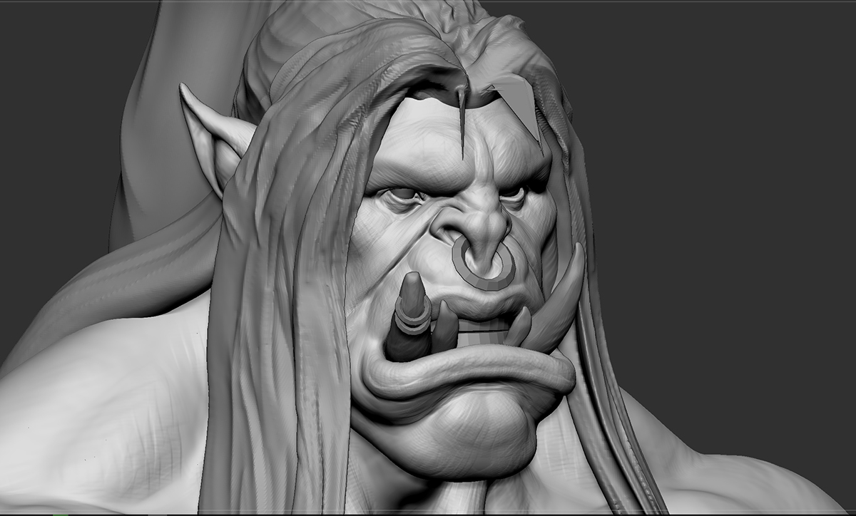
Wow, like the detail already. Cant wait when you will start to paint something out.
Topic starter
17/05/2017 12:13 am
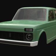
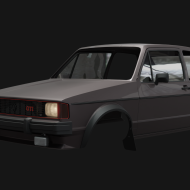
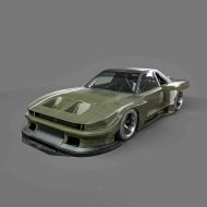
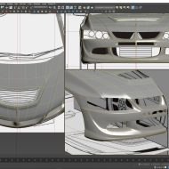
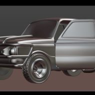
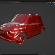
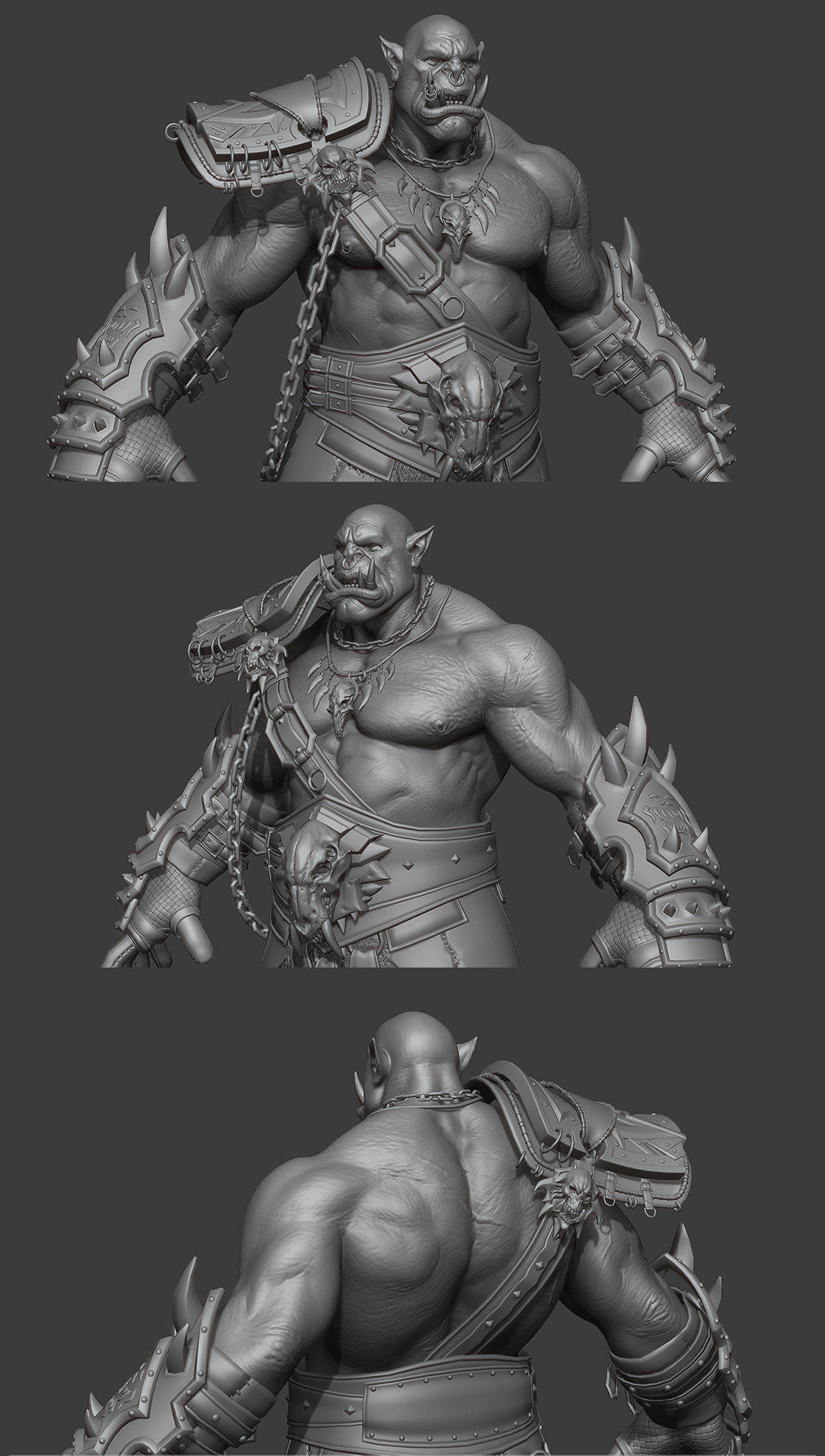
thanks everybody ) here some progress on it . moving on )
29/05/2017 7:18 am
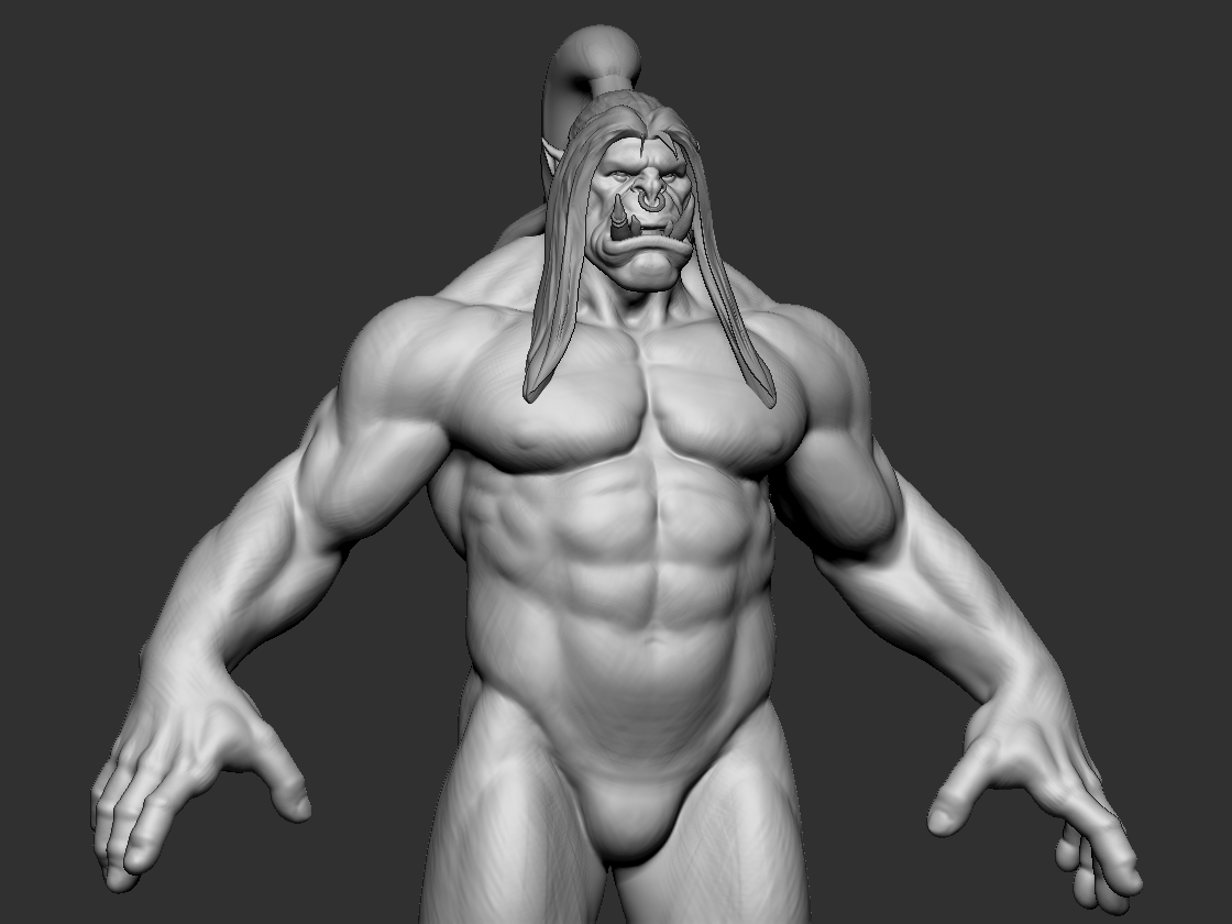
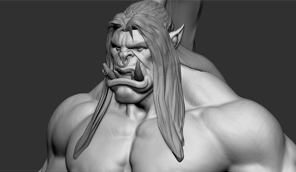
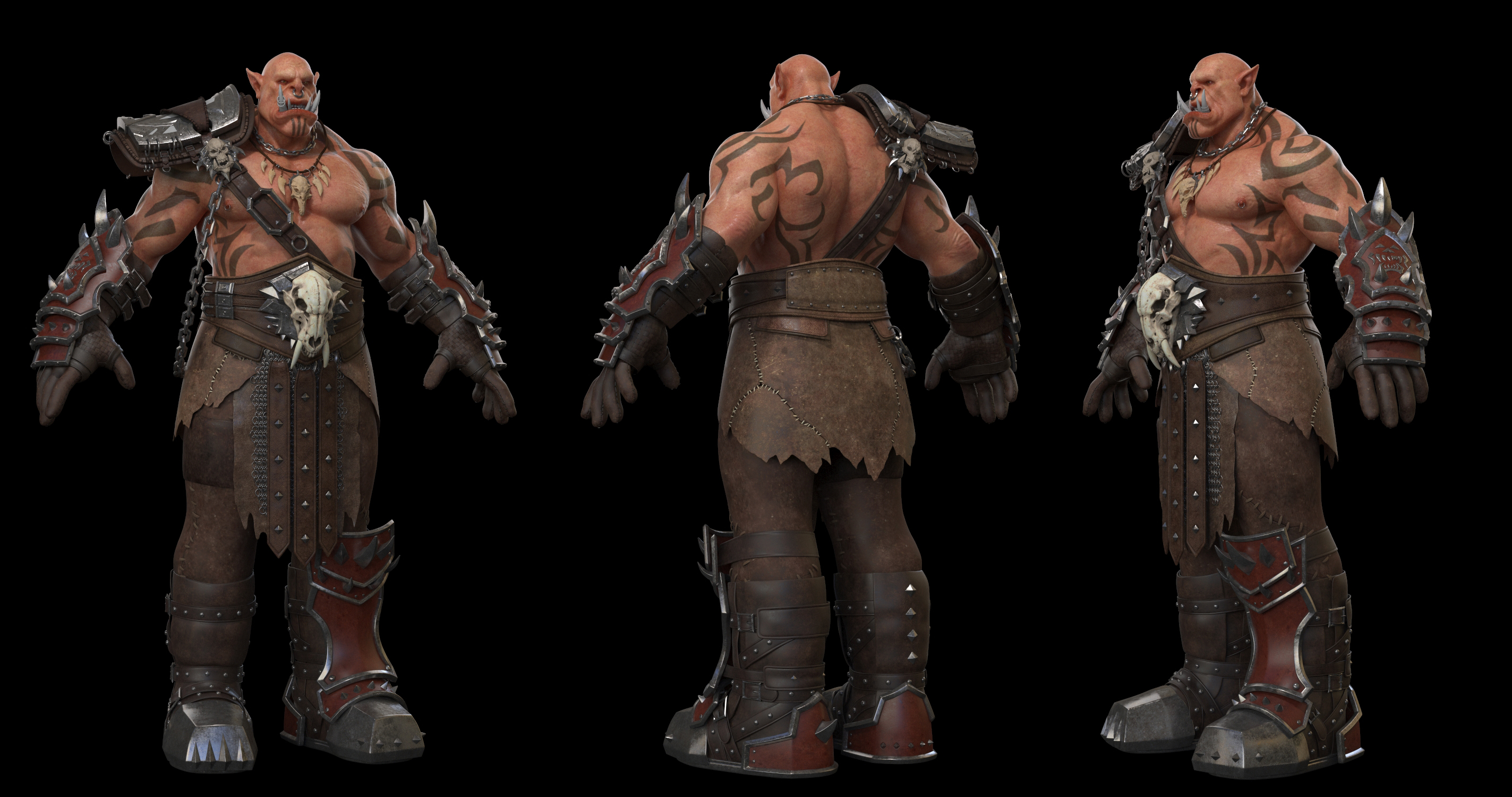
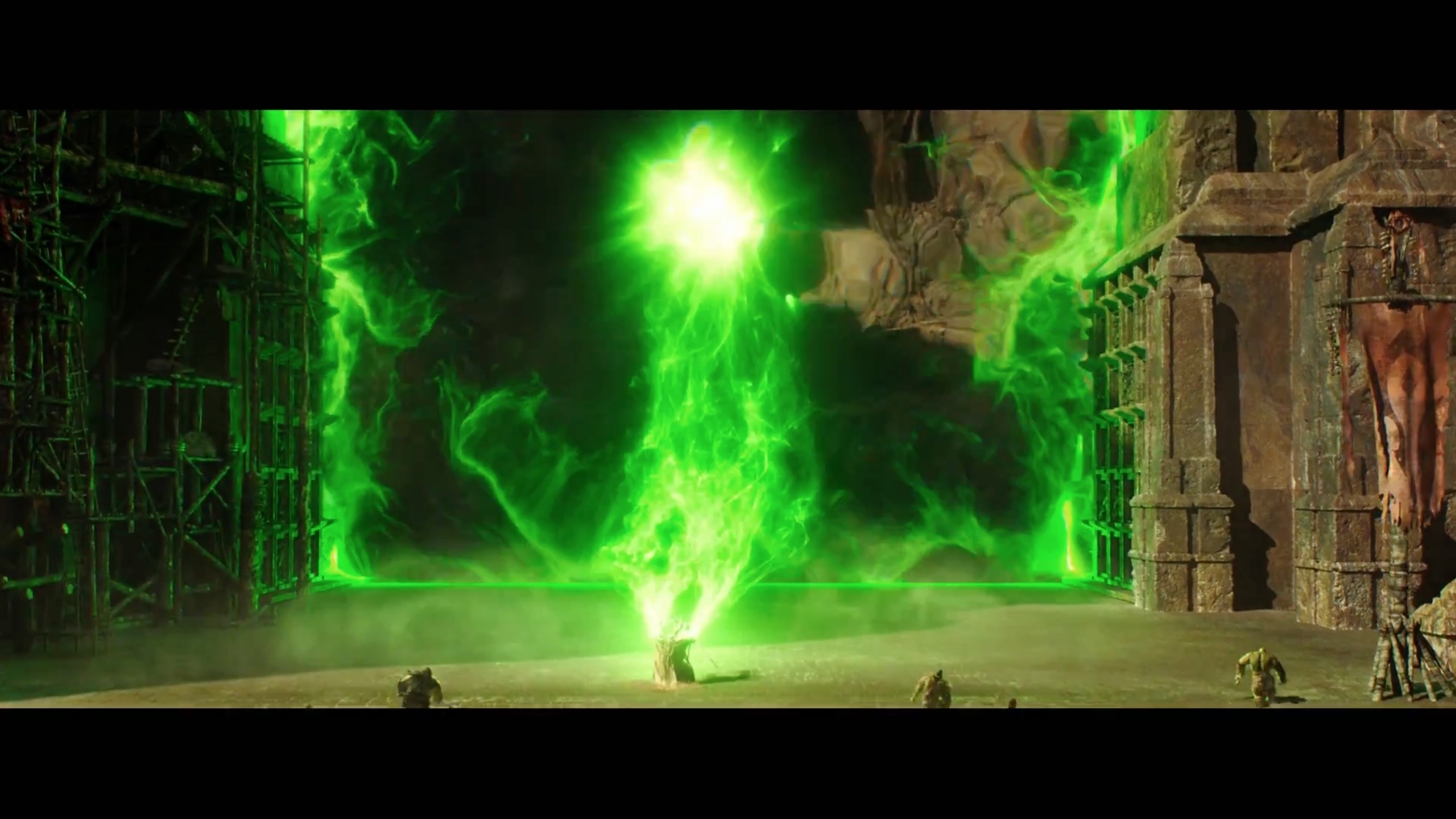
PavelV, please dont get me wrong. It's not that im trying to push my boundries in here, but we have much more potential in this one! I really admire the level of detail you went in with modeling, but please tell me that we still have some time to show it better!
I know I am not the person who should say it. I like your work most, so thats why im doing this. I've spent almost one hour making this for you mate.
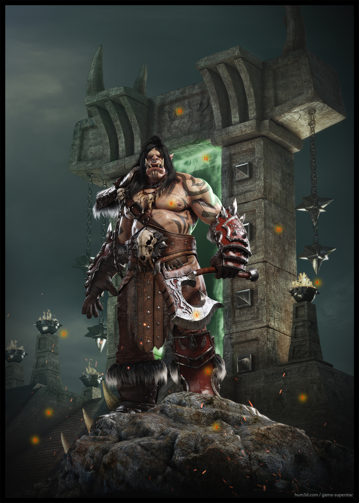
1. Do you think we can get some bump,spec,gloss break up on those leather-ish armor areas? There is something going in with it because of lack of separation.
2. Mapping went wrong, probably when you were adjusting proportions.
3. Can we add one more level od bump to it? Maybe some 3d procedural texture, that will hide streaching areas.
4. Fire in those areas is missing some scale. If you will compare the fire size to the actual env, env feels really small. I know it should be huge compared to the characted, but because of the lack of really small details, breakups and the geometry, i feel like its almost in the same scale as the character, but was just made bigger.
5. Scratches on the edge, and those edgy parts looks almost the same like the scratches on the env rock parts, there is bunch of references how sword behaves after few battles, its pretty easy trick to do. And breaking the spec a bit differently would help a lot. ( I LOVE THE LEATHER BACK OF THE AXE, DAAAMN! )
6. Much less bump on the skin, more variations on other aspects of the shader.
7. Even through the atmosphere, fire usually stays in its color temperature (did you know that on the ocean at night you can see the candle from even 5miles? Thats amazing!)
8. Some more mapping (easy to fix that mate)
9. I feel like we can make some dependence between the stairs and the rock on the sides - mixed dirt?
10. We are having beautiful highlight at the iron parts on the gate sides, do you think we can play a little more with light to make the shape of the gate a bit more dramatic, agressive?
11. In terms of energy compensation of the psyhical aspects of light, the light source cant be darker that the reflection. Look at the color and the intencity of the gate portal, compared to the shoulder mate.
12. Missing some small parts to introduce more realistic scale.
PavleV, you made an awesome job, I think you may actually win. Fingers crossed. Take care!